Pop Art – John Warwicker
By Classic Pop | December 7, 2022
 John Warwicker grew up steeped in music history, so it’s no surprise that his designs would eventually grace the sleeves of artists as diverse as Lloyd Cole, Janet Jackson, The Psychedelic Furs, The Police and Underworld. Classic Pop caught up with him for a look back at his impressive pop portfolio… By Andrew Dineley
I know that you’re now based in Australia and Japan, but where did it all begin for you in the UK?
I grew up surrounded by music in Southeast London next to where David Bowie spent some of his teenage years. Behind the park that backed up to our garden was Elmstead Woods with the railway line and hill that he referenced in The Buddha Of Suburbia.
Just beyond that was Bromley, with the market square that Ziggy Stardust pushed through in Five Years.
After primary school, I went to Dulwich College and became friends with David Rhodes, who went on to work extensively with Peter Gabriel and was also integral to the sound of Blancmange and many others.
The art department was a refuge for those that didn’t fit in, David Rhodes and myself being part of this small group. I was exposed to other forms of music and therefore graphics from an early age because there was a network to connect with.
Music mattered, it shaped our world – record covers were flags of allegiance proudly displayed under your arm every Saturday as you returned from the record store. Contemporary art and graphics and music all merged into a rich path of investigation.
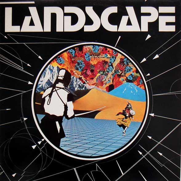
It was while I was there that I was asked to design a poster for a gig by Landscape, who at this point were a jazz-fusion band, very different to the synth-pop act they would later become. They liked the poster so I ended up designing their debut album cover.
So the first Landscape album in 1980 was all hand-drawn with screen-printing, transfer lettering and collage?
Yes it was. I’m sure it’s hard for the current generation of designers to imagine what artwork was like in those days, bits of board, Letraset, photographic prints and typographic printouts all stuck down with cow gum on to acetate overlays with printer mark-ups in Rotring pen, all taped together and all bound together with a great deal of hope!
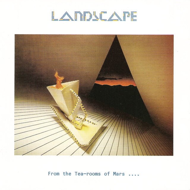
Landscape made it big with their sophomore release, From The Tea-rooms Of Mars… which contained the hit single, Einstein A Go-Go. The sleeve design and sound of that album were both in massive contrast to what had gone before.
Apart from the lettering I didn’t have as much to do with this sleeve. The band found a ceramic sculptor and the record company helped photograph the piece.
It all looks very computer generated but the logo was drawn by hand as were the portraits of the band, the original computer printouts just weren’t sharp enough. It was a very high-tech look created using low-tech equipment.
- Read more: Pop Art – Duran Duran
As I was finishing my degree I became interested in the possibilities of computers, so after a year off I went to Birmingham Polytechnic to do a masters in electronic interactive media, spending a year or so writing code and hoping someone would invent Apple so I could spend more time on design than programming!
It was during my stay in Birmingham that I met the early Duran Duran, before Simon and Andy joined. I designed some of their early gig posters, it was amazing to see their swift rise into global pop stardom. I’d love to have designed their first releases, but EMI quite wisely chose Malcolm Garrett/Assorted images.
On returning to London, I was introduced to Alex McDowell who had a studio called Rocking Russian Design. He wanted to start something new and that’s when he and I, with Tom Bowyer and James Gracie started Da Gama.
Blitz Magazine offered us the opportunity to design a record sleeve using a new Scitex graphic computer and they chose to feature Freur, the band that I was in. Rick Smith and Karl Hyde asked me to join the group as video DJ.
Freur was also noteworthy for using a symbol for their name, a couple of years before Prince got around to doing something similar.
We were all excited at having a symbol as a name but the record label was less than impressed. CBS said: ‘you can’t have it because you can’t enter this on our new computerised sales systems’ to which I replied ‘I can’.
So the symbol stayed but CBS insisted on us using the lettering, too. The symbol was a graphic interpretation of Rick saying Freur, which in his wonderful Welsh brogue sounds like Frrrrreur!
- Read more: Pop Art – David Storey
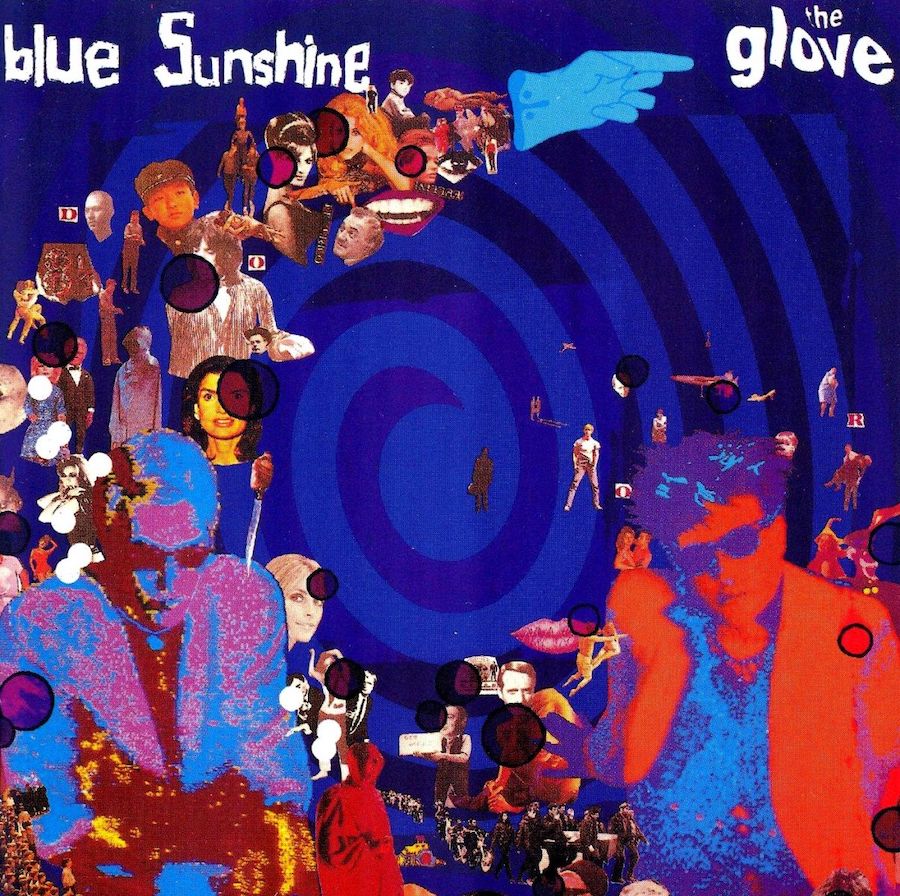
In 1983, Da Gama worked on the album and single sleeve designs for The Glove, a short-lived side project for The Cure’s Robert Smith and The Banshees’ Steve Severin. Those designs were a perfect visual representation of the music they packaged – a dreamy, trippy, hyper-hued swirl of musical and visual experimentation.
The design work for The Glove is amongst my favourites created with Da Gama. Alex knew Robert Smith and Steve Severin through working on albums and videos for The Banshees and he brought this project into the studio.
It was a team effort, I worked on the computerised portraits. The Beatles obviously inspired the design, as did Yves Klein for the colour blue of the inner sleeve of the Blue Sunshine album.
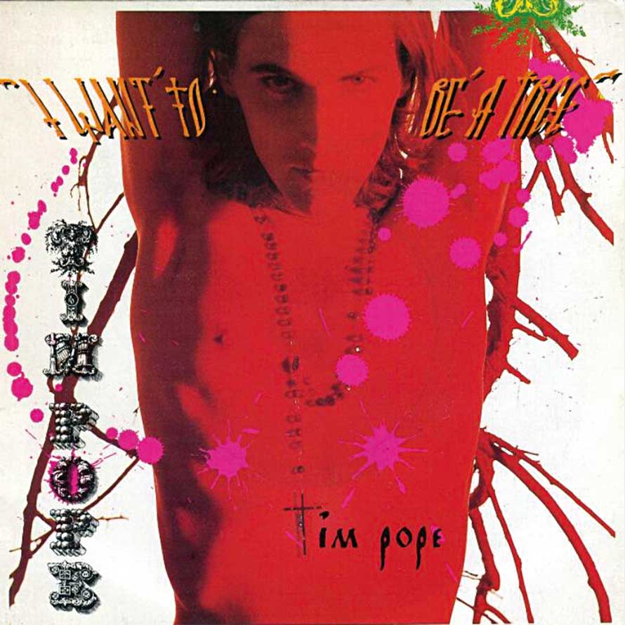
Fans of The Cure will be aware of their enduring creative relationship with video director Tim Pope, but a lesser-known entity, is Pope’s single, I Want To Be A Tree. It’s essentially an uncredited Cure track written by Tim with a sleeve design by Da Gama.
We had a very close relationship with Tim Pope. We art directed many of his videos. I think it’s important to say that Da Gama was to my knowledge the first, or at least one of the first studios to art direct both sleeves and videos.
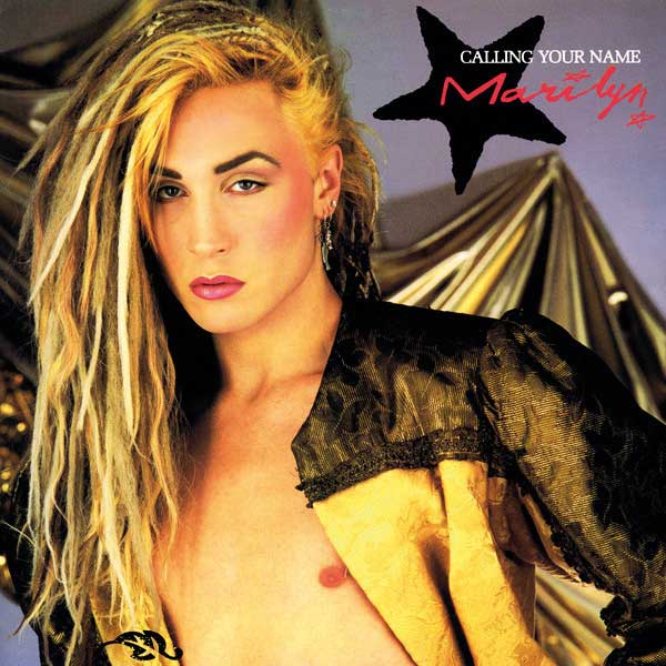
In the mid-80s, Da Gama’s portfolio eventually crossed over into the mainstream with up and coming acts like Fiat Lux and bona fide chart fodder such as Bananarama and Marilyn.
Marilyn was an interesting character, as long as he looked good in the photo he was happy and this is completely understandable. As is the case with such artists, the management also has a strong voice in the creative process. As far as they were concerned, there’s the logo, the picture and a very readable title.
I would have loved to get Marilyn photographed by Nick Knight as I think Nick would have elevated Marilyn’s image, unfortunately it wasn’t to be. Bananarama was Alex’s project, the record company offered us the challenge and because they were a mainstream band it was extremely interesting.
Thomas Leer is an artist who has largely flown under the mainstream radar but his album The Scale Of Ten is arguably the peak of his commerciality. Your sleeve designs for him are further examples of computer-based design before we really had computers to design with.
Thomas was a gem and it’s a shame he’s not more widely known. We concentrated on Thomas as a character, an observer, apart from the world, almost spy-like. International was, I think, the first record sleeve that included one of my own photographs and his album, The Scale Of Ten one of my own paintings.
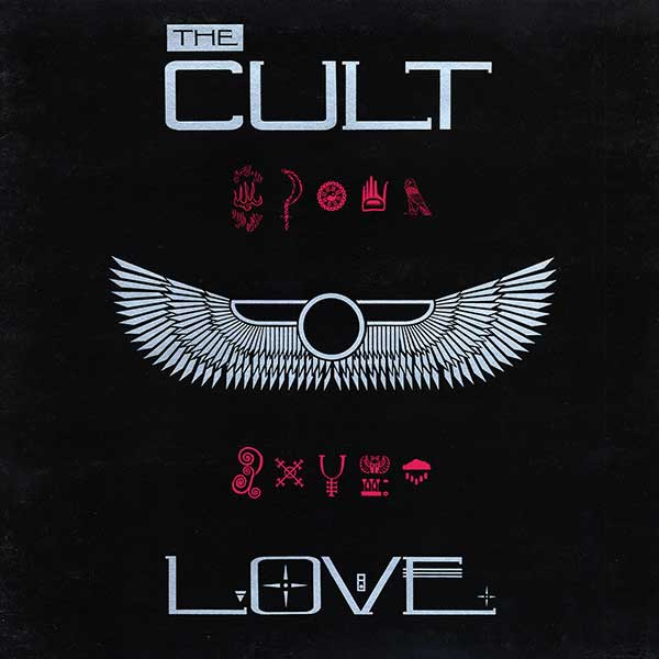
It was around this time that Da Gama closed and Alex went to America and became one of Hollywood’s top art directors. After that, James from Da Gama and I set up a short-lived studio called x=x and designed The Cult’s Love album sleeve amongst other things.
Brilliant, a fleeting musical ensemble featuring June Montana with Killing Joke’s Youth and The KLF’s Jimmy Cauty, recorded a cover of James Brown’s It’s A Man’s Man’s Man’s World, which also had an x=x design credit.
Jimmy and Bill Drummond from The KLF were very involved in the sleeve design. The work I had done previously with computer imaging seemed to strike a cord with them so it was just a matter of choosing the imagery to process.

Another band that never made the impact critics expected was The Lover Speaks. It felt like 1986 should’ve been their year but the single No More I Love Yous sank. But the designs for The Lover Speaks were a change in direction for you.
I was art director and head of video at A&M by this point and there really was great excitement with the record company. They thought they had discovered the Walker Brothers of the 80s!
When I met David Freeman, who was the main creative force behind the band, he was armed with a copy of Roland Barthes’ A Lover’s Discourse which immediately endeared me to him.
He certainly didn’t want to be seen as a ‘pop’ act. I commissioned the Quay brothers to work on the typography and Matt Mahurin for the photography, which I then assembled into a sleeve.
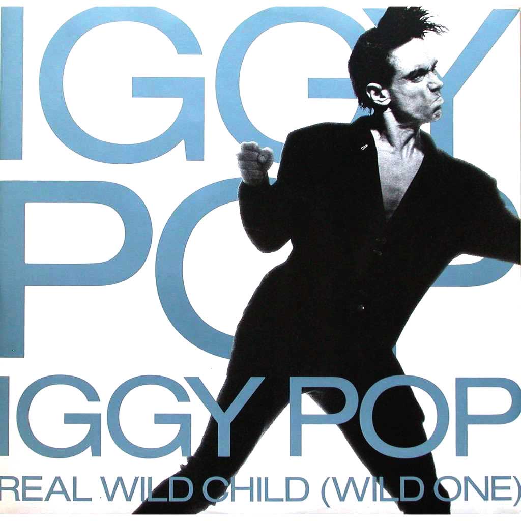
In 1986, you also worked on sleeve designs for Iggy Pop, including his big hit single, Real Wild Child (Wild One).
In front of the camera Iggy was the most professional artist I’ve ever worked with, he was a delight. I remember going to meet him in a Fulham rehearsal suite. As a sequence of doors were opened, the sound got louder and louder, when I opened the last door it was ear-splitting.
And there was Iggy, propped up by the speaker doing The Times crossword! At the photo session by Robert Erdmann, I just asked Iggy to perform. He knew where the camera was and what would make a good photograph. All Robert had to do was anticipate the movement.
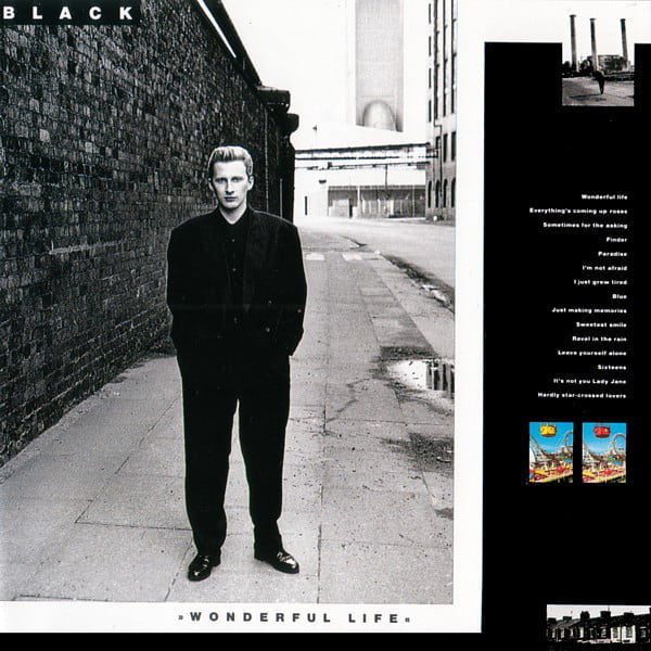
In 1987, you started working with two of that year’s biggest solo artists – Suzanne Vega and Black aka Colin Vearncombe. Both managed to combine artistic credibility with commercial success.
I went with the photographer Richard Croft to New York to photograph Suzanne. She was very guarded, quite unsure and sceptical of being transliterated visually, which I understood. So, I left Richard and her alone to do the photographs as I trusted him implicitly.
Me offering an opinion would not have helped. The lyrics of Suzanne and Colin are well written so it occurred to me that it would be right if they were part of the front cover rather than having a supportive role on the back.
- Read more: Pop Art – Vince Clarke
With Colin it was more collaborative, so much so we remained good friends until his untimely death a couple of years ago. The third member of the creative team was the photographer Perry Ogden. Perry had a way of imbuing the static with quiet dignity and thought which seemed perfect for Colin’s music and his personality.
After that fruitful period at A&M, I joined Vivid ID as creative director. They made movies, pop videos and graphics. The highlight record cover at Vivid was the Rolling Stones’ Steel Wheels that I worked on with Mark Norton and Alex Query.

At the end of the 80s I looked at my portfolio and realised it wasn’t ‘me’. I didn’t rate the work and some of my friends had the same view to their own work, so we got together and formed a collective with no rules, just an obsession with making work and explorations into visual language…
In 1991, Tomato was born. Around this time, Rick and Karl disbanded a “Mk1” version of Underworld. The pair were in the room with their yet-to-be-formed Underworld “Mk2”, along with a lot of other creative talent.
Tomato went on to work on all of Underworld’s future sleeve designs, show projections and most of their videos. I’m still working with Underworld today and still challenged and aided by a close-knit unit of people.
In 2004, you eventually designed some Duran Duran sleeves, including Astronaut. Am I right in thinking that Nick Rhodes was also involved in the design, too?
Nick’s always involved, as is John Taylor. They had already chosen a photographer, Kristian Schuller, so I art directed the photo session and combined the individual photographs with graphics and typography.
For each cover I asked creatives from around the world to send me something within a specific 24-hour period, anything, and I would then act as mix master and produce a design immediately. I also worked on films and projections for Duran Duran during this period.

You’re a busy man, what are you up to now?
As well as my involvement with Tomato, I’m Professor of Design at The Victorian College of the Arts in Melbourne and Visiting Professor at Zokei University and the Kuwasawa Design School in Tokyo.
- Want more from Classic Pop magazine? Get a free digital issue when you sign up to our newsletter!
