Pop Art – Wham! and George Michael
By Classic Pop | May 29, 2024

As young guns George Michael and Andrew Ridgeley arrived in the UK charts in 1982 with a fresh sound and image that stood apart yet borrowed from many genres. It didn’t quite fit, it was unapologetically pop… but there was an intelligence and intent behind the songs – and the way they were packaged. Here Classic Pop revisits the Pop Art of Wham! and George Michael.
By Andrew Dineley
Attention to detail was part of what made George Michael the consummate star he was. When Wham! first appeared, the charts were an eclectic realm of ‘anything goes’. There was still a whiff of post-punk New Wave in the air, disco was clinging on for its life, and groundbreaking electronic-based acts were stepping out of the shadows, posturing their way onto bedroom walls across the land. Record labels heavily relied on the transformative powers of designers, and many of them forged new careers specifically in service to the music industry – a perfect pop symbiosis.
One design studio that appeared the same year as Wham! was XL Design, a small London operation with big ambitions. Tom Watkins, XL’s founder, would eventually go on to establish his creative team as house design studio for ZTT Records, the label behind Frankie Goes To Hollywood et al, but their first sleeve design was for Wham!.

Hunky Pin-ups
In his memoir Let’s Make Lots Of Money, Watkins details his time working with the band. “We designed the original sleeve for their breakthrough Wham! Rap single. It was a line drawing of George and Andrew in profile that I traced from the contact sheet of a photo session. Then we layered ‘exotic’ typography on the sleeve that looked like it had been lifted straight from a Chinese takeaway menu.” There is a naivety to this early two-colour sleeve design, but it’s important to remember that whilst sound may have evolved in the 80s, the design industry was essentially still reliant on tools of the past.
The album that followed, entitled Fantastic, embraced photography, and fans were treated to a smouldering portrait of the duo taken by Chris Craymer. The image was considered so fit for purpose that another shot from the session was used for the single Bad Boys, albeit in black and white. A full-colour third image from the session was reserved for the rare vinyl picture disc.

Leather Boys
Rob O’Connor’s Stylorouge design studio was already well established by the time Bad Boys was released in 1983, and this would prove to be the first of many his studio would work on with George Michael over the years. The cover image is a great example of necessity being the mother of invention, as a series of unfortunate events led to its final design – which O’Connor can now look back on with a smile.
“It’s such a simple cover but it took a long time,” he recalls. “In fact, we did it three times. The first shoot was of George and Andrew escaping down an alleyway, looking like bad boys. It was a bit like that opening scene in Trainspotting, actually. We used images, but George and Andrew didn’t like them – so we did a reshoot with Eric Watson of them dressed as leather boys.
“It looked good, but Eric left the whole photoshoot in a taxi when he was bringing them over to me. All we had left were the clip tests – and as much as we tried, it never really worked. So in the end we used a shot from a third session with Chris Cramer… and that was what became that iconic image of them leaning back to back.”

Making It Big
With a new recording contract, Wham!’s 1984 sophomore album Make It Big couldn’t have been more aptly titled. Now a household name with an international audience and a fuller sound, the sleeve design brought a new level of sophistication – in the UK, at least.
Peter Saville’s design studio PSA accepted creative duties, despite being better known for design work with artists from Factory Records and bands possibly considered more experimental. For Wham!, Saville’s studio dispensed with excess design, presenting the duo via a Tony McGee portrait shot.
This time all the typography was reserved for the back sleeve, rendered neo-classically with an elegantly centred, upper case, serif typeface in black on white. Inexplicably, the sleeve was redesigned for the US market using an image from the same photo session, but the white space was removed and a bold yet bland typeface in cyan and magenta now sadly dates the design in ways not applicable to the UK original.

Credible Artist
For some, it may have seemed odd that Peter Saville would choose to work with such a commercial outfit as Wham! but he rightly had no qualms, recognising George Michael as a credible artist long before it was fashionable to do so. In his book Designed By Peter Saville, the designer elaborates on his admiration for the man. “George Michael made the music that George Michael loved,” he points out.
“He just happened to be archetypal of millions. I went to meet him at Basing Street Studio off Portobello, and I can hear the playback of Wake Me Up Before You Go-Go, which as a pop song is massive. This 20-year-old, who I thought was a performer, tells me that he’s written, arranged and produced it. I thought, ‘This guy is fantastic’. It may be populist, but it’s brilliant. And I can’t be snobbish and avant-garde in front of that.”

Two Sides Of Wham!
Peter Saville’s relationship with Wham! lasted for several singles and would eventually extend into George Michael’s solo career. For Wake Me Up Before You Go-Go, Saville proved that even he wasn’t immune to channelling the zeitgeist, with a design that now looks very much a product of its time.
Interestingly, he – with the assistance of acclaimed photographer Trevor Key – devised a sleeve that didn’t depict the duo themselves, an unusual move for a single that was the epitome of pop from a band that were now the very definition of pin-up poster boys. For the follow-up singles Everything She Wants and Last Christmas, more refined design stylings were revisited with full bleed photography and classic Saville back cover typography.
These two singles illustrated two very different sides of Wham!: Everything She Wants, with its Martyn Goddard portrait, showed the duo as plaintive, serious artists; in contrast, Last Christmas cast them as jokers.

End Of An Era
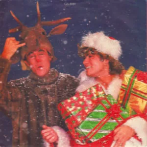
The limited edition gatefold single took the joke even further and included another photograph from the same session, with Andrew Ridgeley the red-nosed reindeer cruelly slaughtered and lying supine in the snow with his festive comrade George, dressed as Father Christmas, wailing at his side – a reference to the press speculation that Wham!’s days were numbered. The supporting text pushed the message home: “But all good things must come to an end, and countless ‘WHAM! SPLIT’ stories are realised as ‘Rudolph’ Ridgeley is struck down by a rabid NME husky”.
Peter Saville Associates would continue to work with Wham! until the end with their final singles. I’m Your Man heralded a step toward design minimalism, with its flat metallic silver and spectral gradient edging. This reductive approach was even more in evidence with the design for The Edge Of Heaven, where everything was discarded bar the Wham! logo placed against a two-tone blue gradient.

Going Solo
Peter Saville’s studio had designed the cover of George Michael’s debut solo single Careless Whisper in 1984, so it made sense that he stay on board for the first single following the announcement of the Wham! split in 1986. A Different Corner saw George Michael returning in a more contemplative mood, and this was reflected in the sombre design. The single was a minimal masterpiece, and its black and white Trevor Key photograph complemented it perfectly. The sleeve gave little away, allowing the song to speak for itself, with just one short line of text obliquely hinting at its origins – “This record is dedicated to a memory”.
1986 also saw the release of George Michael’s debut album Faith, and any residual accusations of George as a teeny-bop idol were quickly discarded by critics upon hearing his new direction. Meticulous attention to detail had been applied to every aspect of the project. George oversaw almost everything about Faith, way beyond song composition, and this naturally applied to the design of the album’s sleeve. For this he collaborated once again with Stylorouge’s Rob O’Connor, who remembers the process fondly.

Iconic Imagery
“George was always really hands-on when I worked with him on the Faith album,” O’Connor emphasises. “He would mark up the photographs to show what he wanted to be retouched. We also designed dozens of different icons for the sleeve, then he came in one day and said, ‘I’ve been working on this myself, and these are the five I like’. For him they represented faith, music, money, fame and love.”
Wham! ended their career on a high with a series of sold-out concerts in China. “One of the many reasons the Chinese chose Wham! and not other groups who’ve asked was because of what we represent: optimism and aspiration,” George remarked. “Also, we’re at the opposite end of the scale to what China sees as the decadent rock acts of the West. You know – sex, drugs, scandal… they want a group who, I suppose, have a clean reputation.”
Any wholesome image aspirations were summarily abandoned with the release of one of the more controversial singles from the Faith album. The promotional video for I Want Your Sex showed George romping around on satin sheets with make-up artist Kathy Jeung, a scenario that would be replicated on the single’s cover. Unusually, the single image came first and was the inspiration for the video. George had seen the picture, taken by James Wedge, and liked it so much that he contacted the photographer to purchase the image for use on the sleeve. Who it is under the sheets was a secret at the time… and according to Wedge, it remains a secret to this very day.

Impressive Pop Portfolio
For the next couple of singles from Faith, Father Figure and the album’s title track, George returned again to the album’s design team Stylorouge for creative support. These sleeves put the artist up front, with some striking portraiture by Brian Aris and Chris Cuffaro respectively. Both photographers were highly regarded in their fields, with impressive pop portfolios. George Michael was clearly on a mission to work with only the best in the industry and was now seemingly confident about fronting his own record sleeves again. Or was he?
In a creative volte-face, the final three singles released from the album returned to pure typography and resulted in some of the most minimal designs of his entire career. Monkey set the tone with its simple black on white, and George had a hand in this – as Norman Moore, the sleeve’s designer, would attest.
“As I recall, our first meeting to discuss the cover was in his dressing room at the music video shoot on a sound stage somewhere,” Moore says. “He was very charming and respectful of the design process. I’m fairly sure it was George’s idea to put the photograph on the back and just have the title type on the front. I had the title typeset very small, then Xeroxed it to make it distressed-looking, and enlarged it with a photostat machine. George really liked the effect and the simple black on white, but asked if I could add an accent over the ‘e’. If there was a reason for the accent, I have forgotten it. It may just have been an aesthetic affectation… why not?”

Maturing Artist
By 1990 George’s status as a mature artist was being reflected in the design work, all created with Simon Halfon. With Praying For Time, Halfon and Michael received a co-credit for a style that followed on from previous singles, One More Try and Kissing A Fool, with a restrained, purely typographic aesthetic. The album Listen Without Prejudice Vol.1 would, however, take another different direction. Its cover image featured a cropped section of a 1942 photograph titled Crowd At Coney Island by Arthur Fellig, a noted US press photographer who worked under the pseudonym of Weegee.
Simon Halfon worked closely with George Michael during this period. “I had known George since the Wham! days and first started working with him on the Listen Without Prejudice album cover,” Halfon said. “There were some big shoes to fill, following in the footsteps of great designers.
“Listen Without Prejudice is such a simple sleeve that it still stands the test of time – and if I had to pick one piece of work that was a personal favourite, it would be this. The single sleeves were just photographs by Russell Young with no typography on the front, definitely inspired by Peter Saville. George and I worked together on and off after that time, including on Symphonica.”

Sexual Liberation
By 1998, George was out, proud and loud, and his single Outside famously became his way of making light of an incident that could easily have seen the end of his career. In many ways it was a song of sexual liberation, with a subtle pastoral cover design that contrasted the themes inherent in the song’s lyrics. The single was included on his Ladies & Gentlemen best-of album that same year – another not-so-subtle lavatorial reference.
During this period George worked closely with graphic designer Greg Jakobek, who began working with George on the 1996 single Fastlove. “At that time I had moved my studio to his offices in Highgate, not only to work on his releases but also for other artists he’d signed to his newly-formed record company, called Aegean,” says Jakobek.
“George really was very hands-on, especially at the beginning, but over the years he became less so. I worked on a lot of singles for George, including Outside, which was great. We sourced a photo from Magnum – we had a large selection of beautiful gritty photos of convicts and arrestees, and we used a close crop of one of these. Some people believed it was George, but it wasn’t. There was an alternative idea of just having a shot of some silver Gucci handcuffs – yes, there is such a thing! – but it didn’t look great.

Creative Vision
“One of my fondest memories was flying to the recording studio in New York when George was working on Songs From The Last Century. The sleeve was designed on a laptop in the recording studio over a weekend, with George passing comments between vocals. We used some great photographs by Andrew MacPherson. I’m also really proud of the design work for the Patience album and its singles Flawless and Amazing from 2004.”
An illustrative approach is sometimes the perfect solution for a record cover design, and George Michael wasn’t averse to embracing this approach where appropriate. For his 2002 single Freeek! he worked with acclaimed comic book artist Stephen Platt, who devised a series of fetishistic costumes for use in the song’s promotional video and images for its sleeves. He also worked with M-I-E animation studios in 2008 on the video and sleeve for his Christmas single December Song, and M-I-E created a beautifully poignant package for the campaign.
Fans will no doubt have their own favourite Wham! and George Michael sleeve designs, but the diversity of styles, collaborators and themes that he chose to employ during his career are testament to a creative vision and a fearless self-confidence that were in evidence from the start to the end.
Wham!’s Fantastic and Make It Big albums have been re-released on vinyl. To order click here
Enjoy this article? Check out our 40 Best George Michael Songs